The BMW OS 10 is the newest and most innovative digital system developed for its "Neue Klasse" vehicles releasing in 2026. As one of the 100+ core applications within the system, the Child Seat App was required an updated safety experience aligned with the new digital design language.
In the team, I worked closely with the product manager and engineering team to ensure the designs aligned with product goals and technical constraints. My main contributions were shaping the core experience and designing 50+ high-fidelity interfaces for implementation.
Insights
Child seats are becoming smarter, but their intelligence remains invisible to parents.
In a scenario that parent driver has limited attention, the experience should prioritize efficiency and clarity with minimal thinking. Parent drivers need a tool for understanding the current states easily and interacting effortless
Solutions
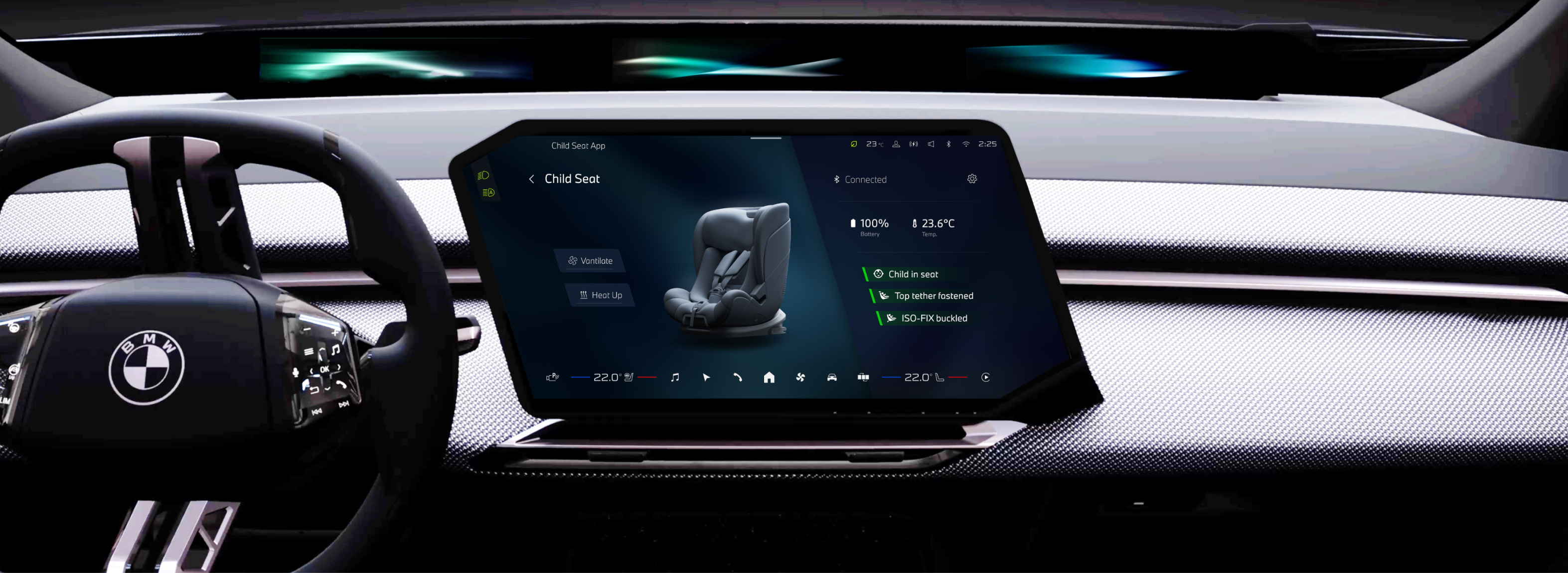
Controls on the left, information on the right.
From testings in car, I found the Driver-Proximity Layout leading faster interactions. Buttons are always closer to the driver while creates more spaces on the right for status information.
A visual-driven control panel for clarifying complex status.
From in-car testing, I found that child seat conditions are difficult to verify from the driver’s position, and seat functions are not easily perceived without clear indicators.
When designing the experiences, I focused to visualizes these invisible states — such as seat functions and safety connections through animations and color-coded indicators. The designs enables users to quickly understand the current system status.
Real-World Mapping of Seat Functions
Signaling Safety Status Through Color & Text
Outcome
Connect, monitor, and control the child seats.
I collaborated closely with engineering and the child seat product team to design the end-to-end app flow and visual system. The experience prioritizes perceptibility and intuitive use, allowing drivers to quickly understand seat status and control functions with minimal effort.
Design Process
Problems + Requirements
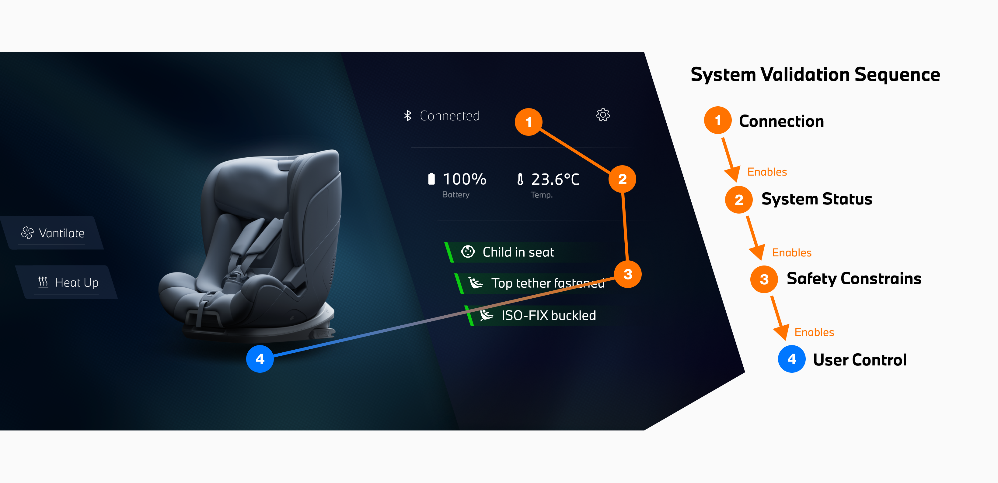
Understanding the seat system for the users and the developers.
In the early stage, I analyzed the child seat system to clarify its validation logic. The system follows a strict sequence — connection, system status, and safety checks must be confirmed before seat functions can be enabled.
I translated this system logic into a clear interaction structure, supporting the engineering team in defining system behaviors while ensuring the interface remains intuitive for drivers.
Early Sketches
Exploring brand language in an irregular interface.
I sketched multiple interface ideas to explore how the information could be structured within an irregular screen. The goal was to align the layout with the brand’s visual language while maintaining a clear and intuitive information hierarchy.
These sketches were drawn in my first week, when I was learning the brand language and designing in the irregular screen most of the time.
Information Architecture & Layout
Designing interface structures of control panel.
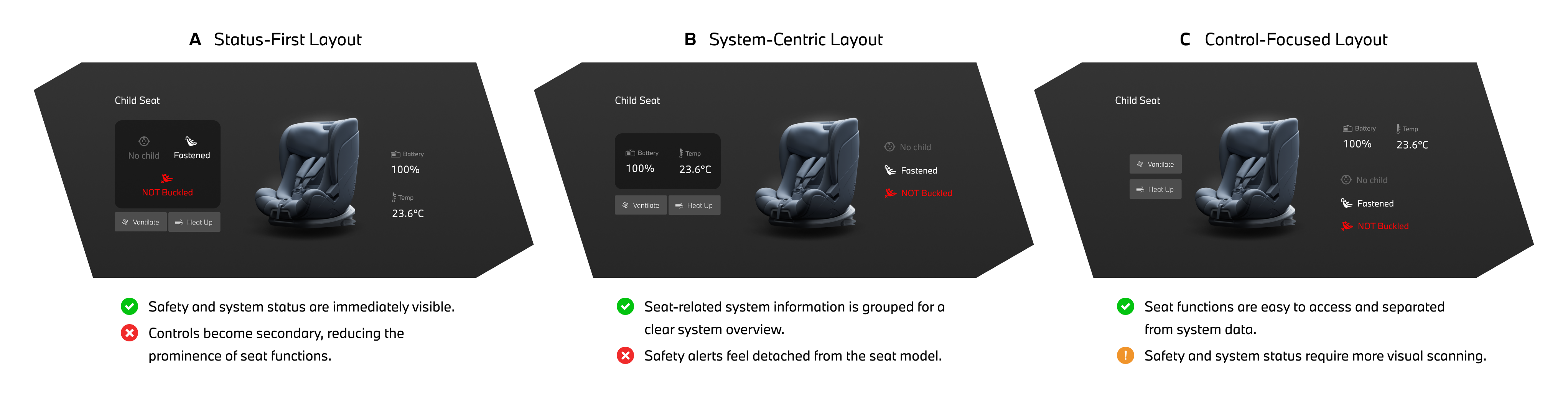
Through internal discussions and testing, I evaluated different layout structures to understand how drivers perceive information and controls. The testing showed that users interact most frequently with seat functions, while system and safety parameters are only checked occasionally.
Although the control-focused layout (C) requires slightly more time to read these parameters, prioritizing controls improves overall usability by supporting faster interaction. This insight led to adopting the control-focused layout.
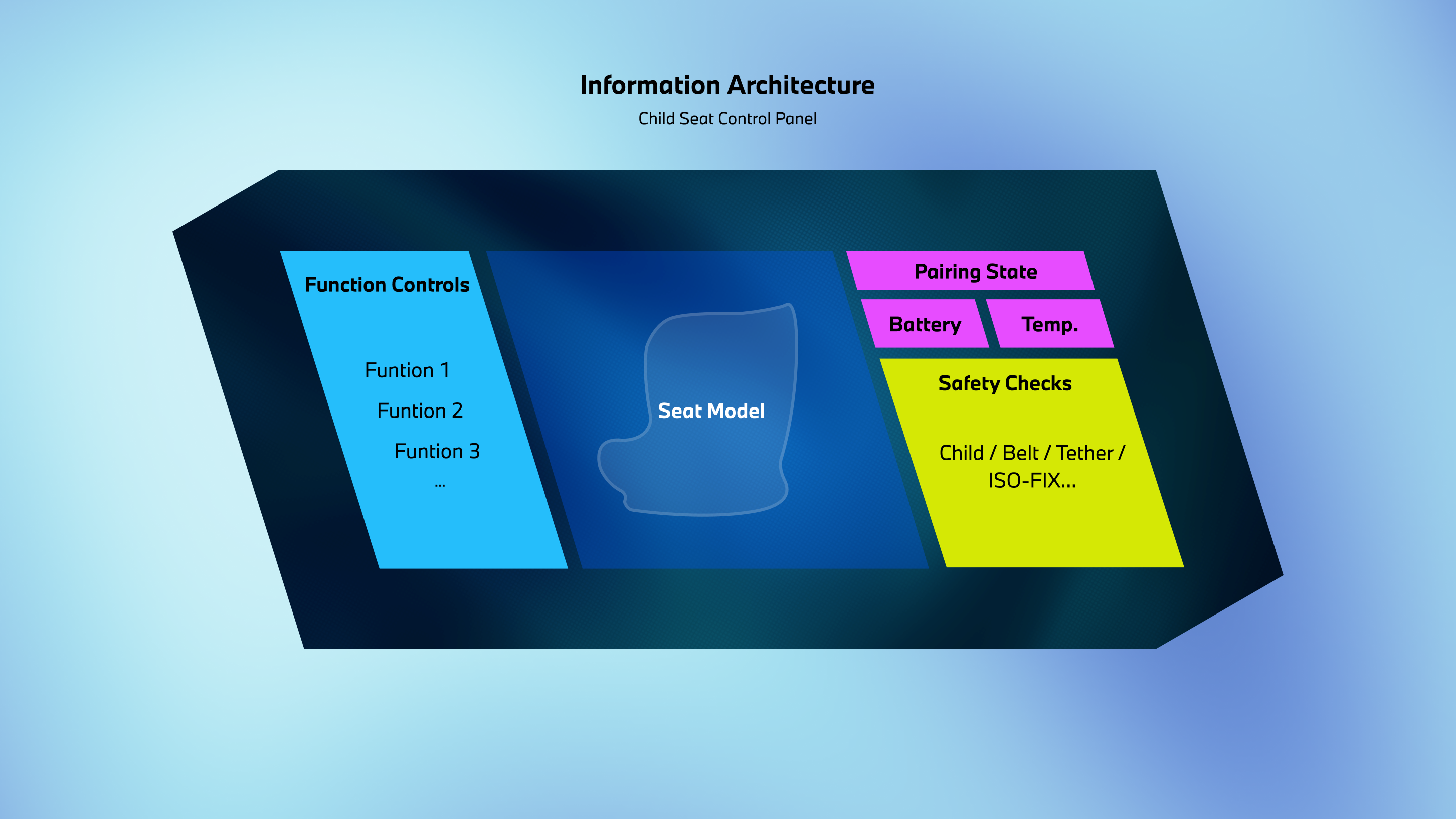
Based on these layout insights, I defined the visual hierarchy of the information architecture: seat controls and visual seat feedback are prioritized, while system parameters and status information remain secondary.
Design Iteration
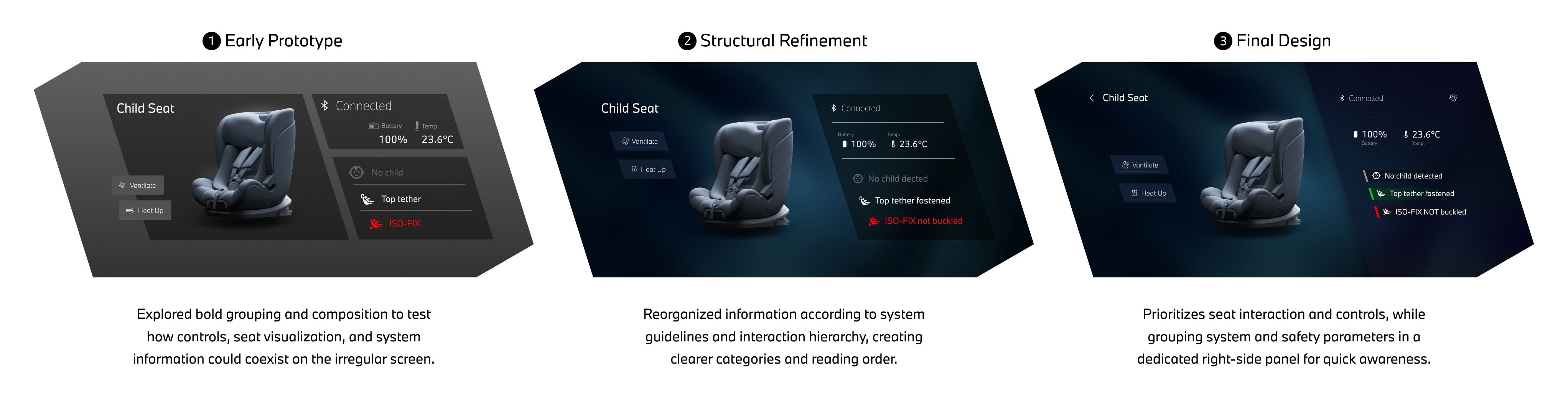
After defining the information architecture, I explored different layouts to balance seat interaction, system visibility, and spatial clarity on the irregular screen. Through iteration, the structure gradually prioritized controls and seat feedback, while system and safety parameters were consolidated into a dedicated information panel.
Early Prototype: Translating the information architecture into interface structure.
Structual Refinement: Clarifying the hierarchy between system information and user interaction.
Final Design: Prioritizing functional interaction as the core of the interface.
UX Decision
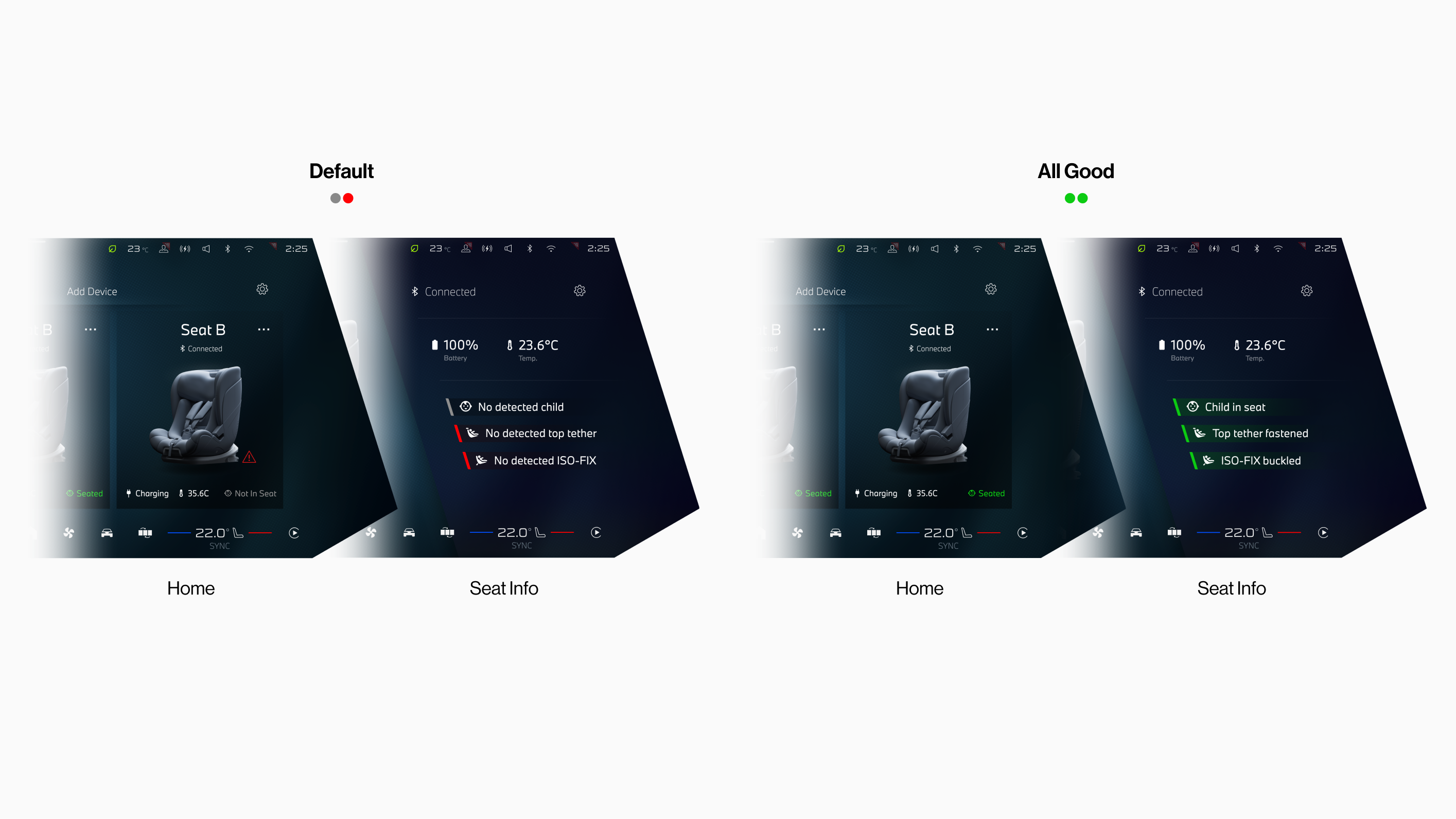
Design clear system status feedback.
Color System: Seat safety conditions are communicated through a three-state color system (red, grey, green). Using color as background indicators instead of text improves readability and makes safety states easier to recognize at a glance.
Safety Status Visibility Across Screens: On the Home screen, safety information is simplified to prioritize seat identification. When a safety issue occurs, a warning icon appears to alert the user, while the Seat Info panel provides the full safety details.
Takeaways
First production project...
Looking back, as my first production project, this journey was nothing short of amazing — from building the concept from scratch to shaping every detail into a real, working product. Over the three months of design and development, the first month was the most challenging yet creatively explosive — a period of mind-blowing ideas and constant learning of the Neue Klasse design language.
As the process transitioned into implementation with the development team, I encountered numerous technical constraints that limited some of my bold ideas and required tough compromises. Still, I strived to preserve the design’s intent and deliver a refined, user-centered experience.I am deeply grateful to Daisy Xu, who entrusted me with this project and treated me as more than an intern, and to Geshan Zheng, whose mentorship guided me through the design system and helped me unlock my potential.